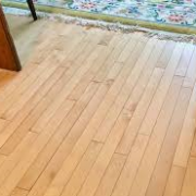
Color can change the look, feel and mood of a space. It’s not the color itself that makes the impact, it’s the reaction to that color. So why is it sometimes so difficult to pick the right paint color for your space? There are a lot of things to take into consideration when choosing a paint color. Here are some helpful tips to guide you through choosing the right paint color for your space.
There has been a great deal of research on the psychology behind color. Whether you realize it or not, color and emotion are closely linked. So, before you look at paint colors for your space, think about how you are using the space and how you want it to feel. If you entertain often or have a big family that you want to create a cozy family room for, you may want to use a warm, inviting color. Whereas if you want your bedroom to feel calm and relaxed for a deep night of sleep, you may want to choose a cool blue. The warm colors are reds, oranges and yellows. Warm colors tend to make us think of the sunshine so we feel more playful and joyous. While your cool greens, blues and violets make us think of water or nature and being relaxed and soothed. Also, cooler colors look as though they “recede,” giving the illusion of space which makes them great for smaller rooms. Warm colors “advance,” so using a warmer color on walls of a larger room will make it feel more intimate. Not all rules apply all of the time though, meaning it’s ok to mix warm and cool colors. The trick to mixing the warms and cools is to keep balance by using the opposite as an accent. So you may add a few cool colored decorative pieces, such as a green throw pillow to your warm inviting family room. Then you not only feel comfortable while conversing with guests, but you also feel balanced.
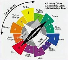
Now that you know how you are using your space and how you want it to feel, let’s narrow down the actual color. There are three primary colors: red, yellow and blue. The three secondary colors are a mixture of two primary colors: orange, green and violet. Just because the paint swatch says “Gray” doesn’t mean that it is a true gray though. A true gray is a balanced combination of white and black. More than likely the gray you picked out is actually one of the primary or secondary colors. That’s why we hear things like, “I painted my walls gray, but they look purple.” That gray is actually a violet. Most of the time, colors are obvious. Blue is usually blue, but there are also blends of colors. There are blue-greens and blue-violets. There are also different saturations of color. Focusing on the saturation of the color will eliminate 75% of your choices. Saturation defines the brilliance and intensity of a color. As the saturation increases, the color will appear more pure and vibrant. As the saturation decreases, the color will appear more dull or washed out. Neutral colors are less saturated, which is why that “purple” gray is really just a desaturated violet. The value of the color itself can play a large role as well. If you look at a paint swatch strip with multiple variations you’ll notice that the lightest of the color is at the top, and as you go down the strip the color gets darker. This is the value of the color. Using the top lighter colors will make the space feel more airy and open, while the more intense, darker colors will feel more intimate and lively.
As we get closer to choosing the perfect color for your space let’s look at a few more small details. Light! Light has everything to do with color. To see color you have to have light. Some colors light bounces off of, while other colors absorb light. Have you ever walked into a room and felt like you had to squint? That’s because too much light is being reflected. Typically the darker the color the more light it absorbs, but not always. Most paint swatches have notes on the back of them with information such as the name of the color, which is also called the hue. There is also a Light Reflective Value, or LRV on the back with a number beside it. That number is crucial when picking out the perfect paint color because it will let you know how much light will be reflected or absorbed. The light reflective value is a scale from 0 to 100. The closer to 0% the color is, the more light will be absorbed, whereas the closer to 100% the more light will be reflected. Staying within the 40% to 60% LRV range is a no-fail because it’s right in the middle, therefore not absorbing or reflecting too much. If there is no LRV on the back of the swatch, ask the paint specialist at the store to look it up or go to the company’s website to find it.
Lastly, let’s dive into color relations a little. Take a look around your space and its surroundings to see if there’s already a preexisting color that needs to be taken in consideration. Maybe your family room has a fireplace with a brick or stone surround that has really vibrant orange colors throughout. Or your bedroom has an attached bathroom with a forest green tiled flooring. What you want to avoid is putting a color on your wall that is going to clash with its surroundings. There are multiple color schemes that help make colors harmonious. Using a color wheel can be a huge help with creating color combinations. For example: When choosing a color for your cozy family room that has an existing vibrant orange brick fireplace, you could use a split complementary color scheme. A split complementary color scheme has three colors. In this case the orange would be the preexisting brick. You want the room to feel warm and inviting, so choosing a less saturated, neutral yellow on the walls would work beautifully. The third color, which in this case is blue, would be your accent color. You could bring some blue into the room with pillows, window treatments or fun décor pieces. Remember to keep balance when using multiple colors.
The colors and design of a home should be a reflection of the people who live there. Choose your paint colors wisely and it is an inexpensive, easy way to create the space you want!
By Melanie Woodard
Polished Interiors, Owner
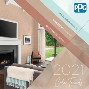
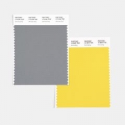 dynamic duo that serves as Pantone colors of the year. The classic color paired with the shining standout hue is sure to invite warmth and comfort into any space. Color trend analysts at Pantone say the two colors exude “A message of happiness supported by fortitude…we need to feel that everything is going to get brighter – this is essential to the human spirit.”
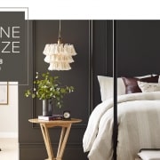 The inspiration for this year, says Sherwin Williams, was a focus on finding sanctuary within your home, “As we’re looking to create the ultimate retreat for reflection and renewal, we’re turning to a hue whose natural simplicity and nature-inspired energy cultivate a sense of calm from the ground up.” Rooted in nature, the hue mixes well with other biophilic elements to help bring the outdoors in and create a sense of relaxation and serenity.